Blog post
Make your app smarter - Extend your app beyond the app’s boundaries
Extend the reach of your app's data and functionality via the built-in OS capabilities like widgets, intents, deep links, shortcuts etc. Sometimes this is the most efficient way to deliver a great experience to your users.

iOS and Android offer a variety of methods for an app to extend its functionality and data beyond the app. With OS features the app can integrate with the phone, the operating system, other apps, and the Internet in general. And sometimes these system integrations can drastically increase the usage and reach of your app with minimal effort. The fact Android and iOS are two of the most powerful Operating Systems ever developed, contributes to a portion of the magic you can create with apps.
Typically when apps are being designed and built, the focus is often solely on the problem the app solves: What is the user situation, what is the best UX for the app to solve the problem, and how should the app be developed to solve the problem, etc. The initial design process is often very focused on the app as if it were a stand-alone piece of software.
The key here is to include OS knowledge in the design and development processes.
Here are a couple of examples of ways to make your app smarter with OS System Integration and some examples of implementations we’ve done.
Widgets

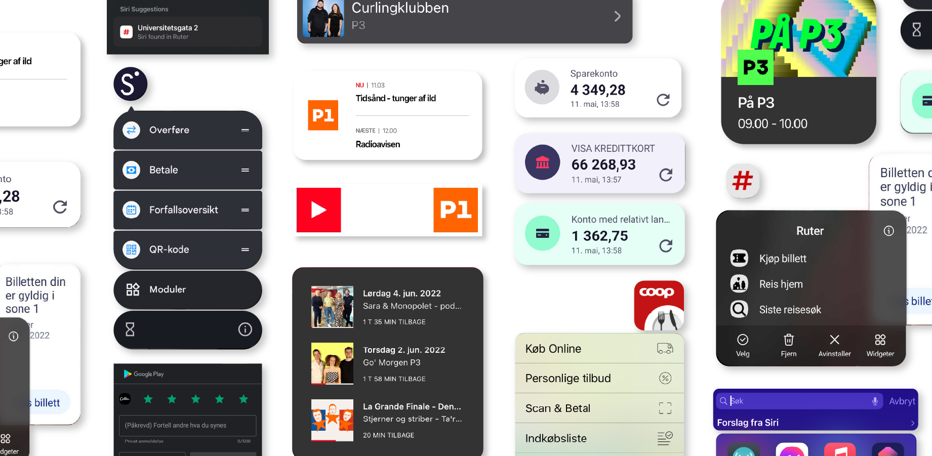
Using Widgets is a simple and effective way to present your app’s features or data on the phone’s Home Screen. The widget will both provide your app with a much more prominent spot than other apps and it will enable you to dynamically promote content or features from your app without a pull from the user. On top of that, the widget can often provide a great user experience by providing relevant information at a glance.
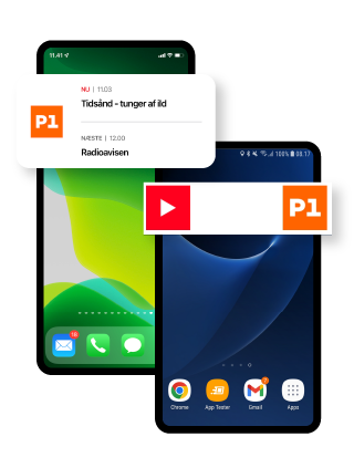
We have worked with widgets on a wide range of apps. A good example is the Live Streaming and Podcast app, DR LYD. The user can place a widget on their home screen with either a “Live” feature or a “Continue Listening” feature. Another example is the ticket app, Ruter, which shows the validity of the user’s train ticket on the app’s widget.
This is a great way to place your app’s content front and center, closer to the client, and reduce the number of taps needed to engage with your app. Furthermore, it’s a great way to promote content.
Quick Actions and App Shortcuts

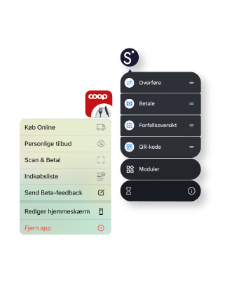
Quick Actions – or App Shortcuts – are a simple way to add a list of shortcuts to the App Icon and make it easier for the user to access a specific feature in your app. It is also a way to inform the user about the main actions in your app. Again, we are bringing the core functionality closer to the user and making it easier to start a specific action in the app. Here is an example from the Retail App, Coop App, and the mobile banking app, Sbanken App.
Assistant actions/Siri Shortcut Intents
Google Assistant and iOS Siri can activate and control apps with simple voice commands. This is an effective way to provide an alternative UI to the user that for some uses is faster and easier to use than a regular app graphical UI. Good examples are tasks like playing music, adding tasks to to-do lists, or setting a reminder – all of which via voice control can be done while driving, cooking, working out, or whatever the user is doing.
On iOS Siri Intents and Suggestions can be used to place your apps in the right context for the user. The Ruter App uses Siri Intents every time you buy a ticket. And if you buy a ticket on a regular schedule (typically in the morning or in the afternoon), then iOS will automatically suggest that you use Ruter to buy a ticket. And similar will Ruter use Siri Suggestions to have the OS suggest a destination based on the use of the last address searched for in Maps.
Again, this is an example of moving actions and activation out of the core app and placing it where it is easiest for the user to activate, removing the need for the user to even launch your app.
Sharing Sheets
Both on iOS and Android your app can place central features in other apps via the Android Share Sheet or iOS Activity View.
These Sharing Sheets enable your apps to offer functionality or actions on data from other apps. If you, for example, have an app that can manipulate an image then you can “promote” this function in the Photo or Gallery apps.
A good example of a case where we have used Sharing Sheets is for the Danish Union, Dansk Metal. Dansk Metal has a service where you can send in your contract or payslip to get it checked by Dansk Metal’s legal advisors. By adding this in the Sharing Sheet then the user can share the payslip or contract directly from the app where they received it or by taking a photo of a paper payslip.
In App Reviews

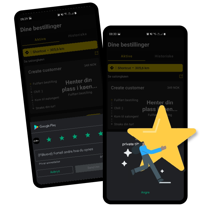
In-App Reviews is a polite way to ask your users to make a review in the Apple App Store or on Google Play Store. Positive reviews from real users are a great way to promote your app. We are pretty much adding this feature to all apps. Three recommendations here: Never ask more than 1 time for reviews. Only ask your loyal users for a review. Thirdly, ask at the right time.
Here’s an example from the Cutters app review prompt. Pretty obvious to the users that their feedbacks are valuable.
Deep Links
Deep links are a simple way to provide one link by which the app can either be opened or downloaded. And you use the same link for iOS and Android. And if you are on a PC then the link will typically send the user to a product page about the app.
The extended version of Deep Links is for linking to specific content.
A good example of a Deep Link is the link to the app Radio4. The Deep Link can link to a specific show or a specific episode. But if the user doesn’t have the app installed on their phone then Apple App Store or Google Play is opened with the Radio4 download page.
Deep Links makes it so much easier to promote apps and promote content in apps – especially on Social Media.
Smartwatch
Another way to get closer to your end user is by making a Smartwatch app extension. You can even make so-called complications which are shown on the watch face. In this way, the users can see your app’s data or your app’s main function on their wrists. Always just a glance away. In order to deserve to be on your user’s wrist, your app needs to deliver essential data or essential functions. For a lot of apps, a Smartwatch extension is not relevant, because the use case is not strong enough. But if your app does and deserves this, then the Smartwatch is a great way to meet the users.
Here is an example from the retail chain, Rema 1000, where the user can register on Rema’s loyalty program by showing the barcode via the Apple Watch.
Android Auto and Apple CarPlay
Another great way of presenting your app’s content and functionality in a new context is via Android Auto or Apple CarPlay. CarPlay and Android Auto use the screen from the car’s infotainment system as an extra screen for the phone. The driver can then control the phone’s apps via Siri or Google Assistant – or you can make a specific CarPlay or Android Auto extension of your app.
Apple is restricting the types of apps which can be shown on CarPlay. Apple will approve apps like Navigation, Messaging, Music and Radio, Parking, Food ordering, or similar for CarPlay. But these types of apps are mainly what you would use in the car.
As an app developer, the main benefit of making an Android Auto or CarPlay extension is that your app becomes more attractive compared to the competitors when used in the car. The sleek interface and prominent placement of the screen make an app with an Android Auto or CarPlay extension so much more relevant while driving compared to an app without this interface.

Make your app smarter today
So, the morale in this short run-through is that we in the design process can gain great benefits by a deeper understanding of the OS capabilities – and integrate these into the app design from the get-go. It is a shortcut to better apps.
This list is not complete at all – iOS and Android offer a series of other more dedicated technologies for showing your app’s data in the user’s car, on the lock screen, or in a digital wallet.
Want to know more?
Let’s make magic happen and craft an app you’ll love.
Tell us about your project.


