
Blog post
Your brain on apps
By Petter Klingen Wright. How and why do you understand apps?
You do it a hundred times a day – open apps. Most often, you instantly know what to do and look for, as you’ve used the app before. But sometimes, your brain can grind to a halt, as you encounter something new, and you’ll need to decide how to proceed. This might happen if you’re using new apps, new features in apps or if an app gives you a message that you’ve never encountered before. You’re suddenly in a different mindset – how does this work?
iPhone, meet my grandmother
I was inspired to write this when I saw my 94 year old grandmother test an iPhone. She has always been more technically literate than most people in her age group. She has a Windows laptop that she still uses to read and send e-mail. But this iPhone had her seriously confused.
She hasn’t been a part of the development of the mobile design language that has evolved the last ten years, so for all the things that I understand, she has to analyse and guess. Why doesn’t it come naturally to her? iPhone apps are simple for everyone… or?
How and why do you understand apps?
App designers should design for the two different mindsets. We can refer to them as the fast and slow mindsets. The fast mindset is at work when you feel like you know the app, and you can act fast and instinctual. The slow mindset is working when you need to assess the UI and deliberate what to do next. The book Thinking, Fast and Slow goes into detail about these two mindsets work, but what you need to know in this context is that humans will avoid using the slow mindset as much as they can.
If you want to make great apps you need to make sure that it works both people in the slow and fast mindsets. The solution is to make sure that you have two things, understandable UI components and great information architecture.
Information architecture
Let’s dive into the latter first. Information architecture is the art and science of organising data in a logical and weighted order. In other words, making sure that things are where you expect them to be. This is easier said than done, as you need to know what the users are interested in and how they would “categorise” the different information and functionality.
In apps, the users expect that the main functionality is accessible instantly. Imagine if the weather app started out by asking what sort if info you’re interested in. You tapped the weather app – you want to see weather-info! And not just any weather-info, the most informant weather-info. You’re most likely interested the forecast for where you currently are.
Want to see the forecast for other places? As it isn’t defined as the “main” task, that will take a tap or two. But which taps? Should it be accessible from the first page? I’m a firm believer in not trying to minimise the amount of taps, but making sure that the user feels in control at all time. Different weather apps have different solutions for this. The Apple Weather makes you tap a list-icon where they have a search field. Other apps have a search button places on the main page of the app.
But, what is this so called list-icon or the search field? Where will the users look for it? How does the user understand what they represent?
Understandable UI components
How do you design a “search” button? Or… how do you design a button in general? Maybe biggest revolution of the early internet was hyperlinks. Or, as we call them 30 years later, links. A button that shows you something different. If you were to use 1993 internet today, you’d immediately recognise the underlined blue text as links. But consider this, how would you know what theywere back then?
To encounter a hyperlink, you would’ve been on a computer, so you had to know what a digital button was and how to control a pointer with a mouse. The hyperlink was a logical next step, based on existing parts. So the step in itself might not have been as big, but its consequences were.
In apps, we have loads of components that we encounter time and time again, like buttons. The default button in iOS actually looks pretty much like the first hyperlinks – it’s just blue text. And since we have pressed a vast amount of buttons before, only small hints make us understand what they are. A rounded rectangle? Probably a button. An icon in a circle? Probably a button.
So how do you design a search-button? Well, now we need to combine what we now know about information architecture and understandable UI components. We might not want a button that says “Tap here to start search” as it could take up more space than want it to. We want it to be accessible, but not so much that it takes our attention away from the apps main functionality. We expect apps to have buttons in the top right corner. Maybe just place an icon there?
Icons
But then, what sort of icon should it be? Icons are notoriously hard to design. Most icons, we understand just because we’ve seen them so many times.
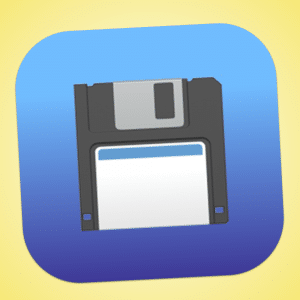
A save icon is still mostly displayed as a floppy disk, even though we stopped saving things by writing them to floppy disks years ago. You might think that it’s better to come up with a new icon now, but it’s not really that easy. How do you describe the idea of storing data to a local hard drive in a very small space? Whatever you come up would make people use their slow mindset and that’s not really good.
Just by being consistent, we can convey advanced functionality with a just few pixels. Search functionality have been indicated by a magnifying glass just as long, so it makes sense to use that in the weather app.
The language of apps
Whenever you’re looking at your phone, your brain is doing pretty much the same work as you’re doing when you’re looking at a save icon. You see things, and based on how you’ve seen similar things work in the past, you instinctively know how to use it. If you’re in a iOS user, you know that if there is three or four icons in the bottom of an app, you will switch to different functionality by tapping them. If you’re an Android user, you know that three lines in the top left corner means that you can tap it to view some important navigation.
This feels logical, but it is really important that you remember that the main reason that you’re understanding it, is because you’ve encountered similar components before. iOS and Android have their own design language (Human Interface Guidelines and Material Design, respectively) which is evolving all the time.
The future language of apps
One functionality I really like is pull to refresh. If you are in a list where the data could be updated (like in a mail app) you can often scroll the “wrong way” in order to refresh the data. I think it’s clever because scrolling up is an indication that you’d like to see if there is more information. This was not developed by Apple or Google, but by an independent developer who made the Twitter app Tweetie. It didn’t take long before a lot of apps (even the Mail-app by Apple) implemented the functionality.
These days we expect that feature to be there, but as technology evolves, the design language needs to evolve alongside it. In realtime apps, there is no need for pull to refresh, so what do we then do when users get confused when they can’t do it? And what changed do we do in the apps now that iOS apps run on Macs? How different will the design language be when we need to make apps for AR glasses?
Looking back to the future
There isn’t a lot of obvious answers to questions like these. App design is, as a lot of other things, a balance. We need to balance innovation with consistency, branding with recognition, main functionality with control, pretty visuals with usability and so on.
One of the reasons to why the popularity of apps exploded in the late 2000s/early 2010s was because they were so easy to use. The first iPhone was 320 x 480 pixels, so you really didn’t have that much space to go on. The language of apps wasn’t as evolved either, so your pick of components were limited. And the state of the developer tools probably made the developers say no to the designers more often than they do these days.
(Wr)apping it all up
Do you know how many buttons there currently is in a conversation page in the Message app in iPhone? 15, plus all the letters and all the messages you can tap. Some buttons even reveals menus with even more buttons. Having to look through a screen and analyse what 15+ icons/buttons represent is hard work if you have no frame of reference. It’s no wonder that my grandmother didn’t pick up how to send messages through the iPhone.
She’ll probably never replace her phone with the T9 keyboard, even though it (for me) seems way more complicated.
I’m not saying that you should make apps for my grandmother, but it might be helpful to keep her in mind. In the end, the main goal of an app is help the user do what the user would like to do. Our job is to give normal people superpowers by making them immediately understand what a button does. And the road to that superpower is empathy and research.
It seems simple enough, but as explained thoroughly here, it really isn’t. People will read apps based on their experiences, leading them to do things different than what you planned for. If an app design “fails”, it’s probably because of unclear UI components or illogical information architecture.
But failing isn’t that scary when it comes to digital design. Ernest Hemingway once said, «The only kind of writing is rewriting». The same is true for digital design. The only kind of designing is redesigning.
PS: And please, for the love of apps, don’t think adding guides to how entire apps works help. Those guides assume that people like to read. Let me assure you, they do not.
Vill du veta mer?
Låt oss få magi att hända och skapa en app du kommer att älska.
Berätta om ditt projekt.


